
Pricing Page Redesign
Redesigned AfterShip's self-serve pricing around ICP-led value messaging, a simplified volume slider, and SEO-first information architecture. Shipped to 100% of traffic after a 33-day A/B test (n ≈ 8.3k, PostHog conclusion = won): Contact Sales CTR +58.3% sig, Choose Plan clicks +75.6% sig, Account Create +49.9% sig.
Context
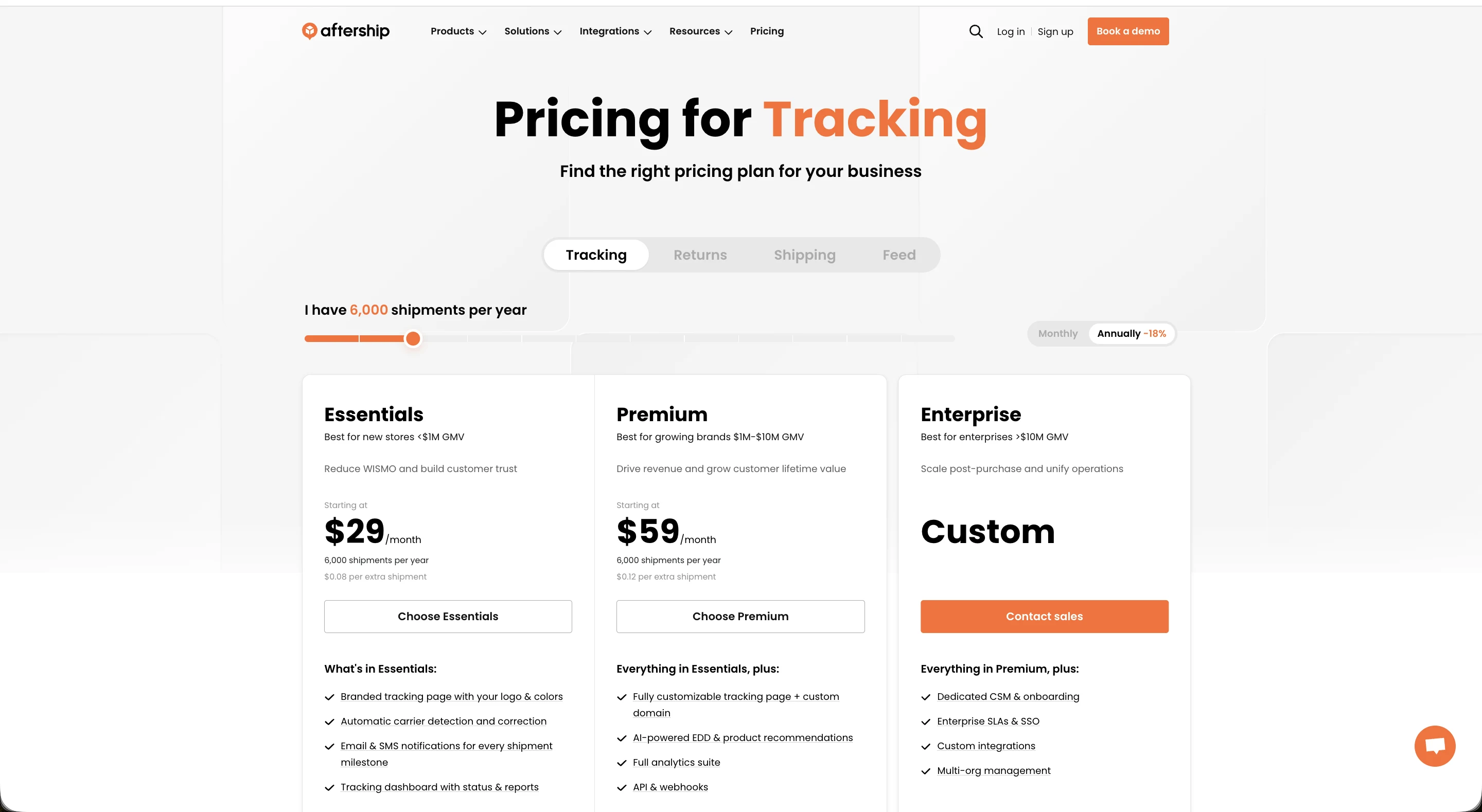
AfterShip's pricing pages were structured around feature lists and price points — not around the merchants they were designed to serve. Merchants arrived from search, scanned a table of features, and picked a plan based on price rather than fit.
The downstream cost was measurable: 17% of new self-serve customers were on the wrong plan in their first month. Some churned when costs exceeded expectations; others churned when the plan felt too limited for their stage of growth. Both outcomes came from the same root cause — the pricing page didn't help merchants self-identify which segment they belonged to.
The problem
17% plan mismatch in the first month.
Internal data showed that a meaningful share of new self-serve customers were mismatched to their plan immediately after signup. The $1 monthly campaign was one measurable signal: Essentials plan signups from that campaign were largely first-time store owners — yet the plan messaging at the time didn't speak to that segment. The product communication was plan-first rather than merchant-first.
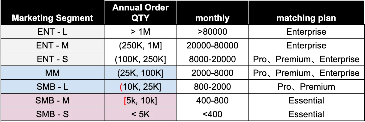
Plan mismatch rate — first 30 days post-signup
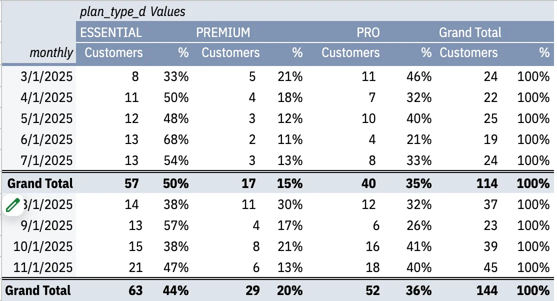
$1 campaign analysis — Essentials cohort breakdown
Hypothesis
Lead with segment fit, not feature inventory.
The hypothesis was direct: if each plan card leads with the type of merchant it serves — described in terms they use for themselves — more merchants will self-select into the right plan. Feature lists are necessary for evaluation; they are not sufficient for initial orientation.
Secondary hypothesis: reducing the volume slider from 13 steps to 4 ICP-anchored breakpoints would decrease cognitive load at the most decision-critical moment on the page.
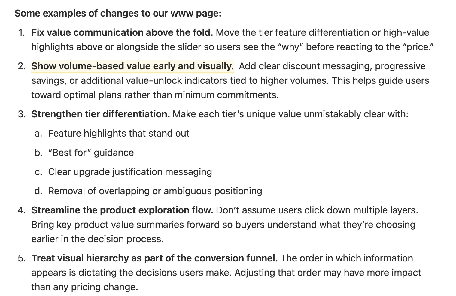
Proposed approach — from feature-led to segment-led plan cards
Plan messaging framework
Describe the merchant, then describe the plan.
The redesigned plan cards were restructured around two elements that appear before any feature is listed: a segment label that names who the plan is for, and a GMV / volume anchor that gives merchants a concrete self-check. The feature list follows — but is no longer the headline.
Tracking plans were mapped to GMV segments:
Essentials
Starting brands
Under $1M GMV · first store
$9 / mo
Pro
Growing brands
$1M – $10M GMV · scaling ops
$99 / mo
Premium
Established brands
$10M – $25M GMV · complex needs
$199 / mo
Enterprise
Global operations
$25M+ GMV · custom contracts
Custom
Returns plans were mapped to monthly return volume:
Essentials
Light volume
Under 200 returns / mo
$9 / mo
Pro
Growing volume
Under 400 returns / mo
$49 / mo
Premium
High volume
Under 400 returns / mo + advanced
$199 / mo
Enterprise
Unlimited
400+ returns / mo · custom SLA
Custom
Volume slider
From 13 arbitrary steps to 4 ICP breakpoints.
The existing volume slider had 13 increments — a precision that implied an accuracy the product didn't have, and created unnecessary decision friction. Most merchants don't know their exact shipment volume; they know roughly what tier they're in.

Current state — 13 volume steps with no ICP anchoring
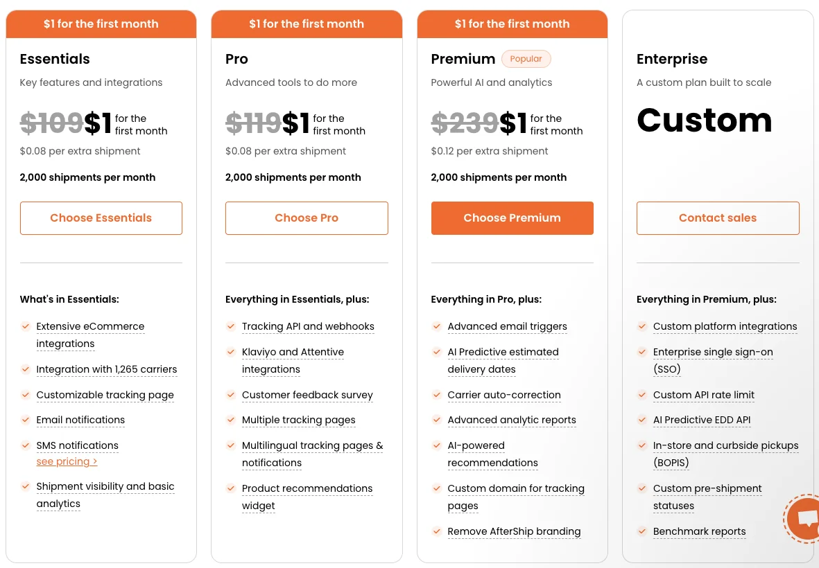
Current plan cards — feature-led, no segment anchoring
SEO & information architecture
Pricing pages are also acquisition surfaces.
A pricing page redesign that only addresses conversion misses the upstream problem: not enough qualified merchants are finding the page in the first place. Three SEO requirements were included in the redesign scope alongside the messaging work.
| Requirement | Rationale | Implementation |
|---|---|---|
| H1 keyword | "Pricing" must appear in the H1 for the page to rank for transactional pricing queries | Hero H1: "AfterShip Tracking Pricing" / "AfterShip Returns Pricing" |
| FAQ section | Generative search surfaces structured FAQ content directly in AI answers; FAQ content also captures long-tail queries | FAQ section restored below plan cards; 6–8 questions per product |
| Schema markup | Structured data signals allow search engines to display pricing directly in results | Product + Offer schema · FAQPage schema · BreadcrumbList schema |
The FAQ section had been removed in a previous redesign iteration to simplify the page. That decision optimised for visual cleanliness at the cost of SEO signal. Restoring it with curated, intent-matched questions addresses both GEO (generative engine optimisation) and traditional search visibility.
Results
Shipped to 100% of traffic. Four sig wins across the funnel.
A 33-day PostHog A/B experiment ran the new pricing layout against the original (50/50 split, n ≈ 8.3k merchants across Tracking and Returns pricing surfaces). PostHog returned conclusion = won and rolled the new design to 100% of traffic. The redesign produced statistically significant lift at every upper-funnel step, with paid-subscription value moving in the positive direction.
| Metric | Control → Test | Lift | Significance |
|---|---|---|---|
| Pricing → Contact Sales CTR | 1.04% → 1.65% | +58.3% | sig ✓ primary |
| Click Choose Plan | 2.44% → 4.29% | +75.6% | sig ✓ |
| Click Essentials plan | 1.59% → 2.54% | +59.8% | sig ✓ |
| Pricing → Account Create | 1.02% → 1.53% | +49.9% | sig ✓ |
| Paid Subscription Amount | $0.68 → $1.00 / exposed | +48.0% | direction |
The experiment also surfaced a sharp ICP signal: 87% of pricing traffic and 100% of qualified Contact Sales form submitters came from desktop — validating a desktop-first decision hierarchy for the page layout. Lift was positive across every major market measured (US, IN, CN, HK; +54% to +105%), confirming the ICP-led value messaging worked beyond a single segment.
Design decisions
Three choices that defined the direction.
| Decision | Alternatives considered | Why this direction |
|---|---|---|
| Segment-first card structure | Feature-first (status quo); price-first; outcomes-first | Merchants orient by who they are, not what they want to do. Segment labels create recognition, not recall — faster self-selection at lower cognitive cost. |
| 4 slider breakpoints instead of 13 | Keep 13 steps; add labels to existing steps; remove slider entirely | Most merchants are stage-aware, not volume-precise. 4 named breakpoints reduce false precision while preserving the interactive price estimate that self-serve buyers rely on. |
| FAQ section restoration | Keep section removed; add inline tooltips instead; consolidate into help centre link | Inline tooltips don't surface in search. A help centre link adds a navigation step. FAQ in-page is both a buyer-aid and an SEO signal — two jobs for one section. |